Cards
For full examples with variations and API docs, see the cards reference in Pattern Lab.
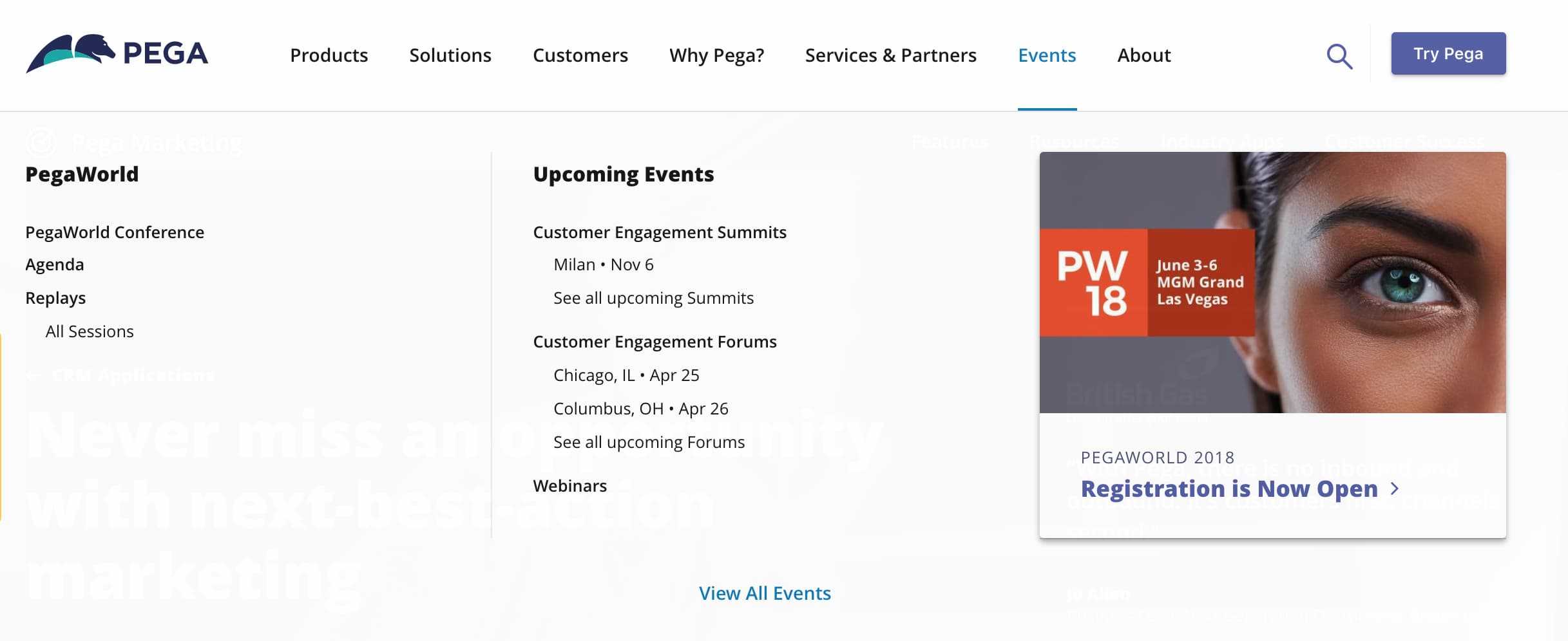
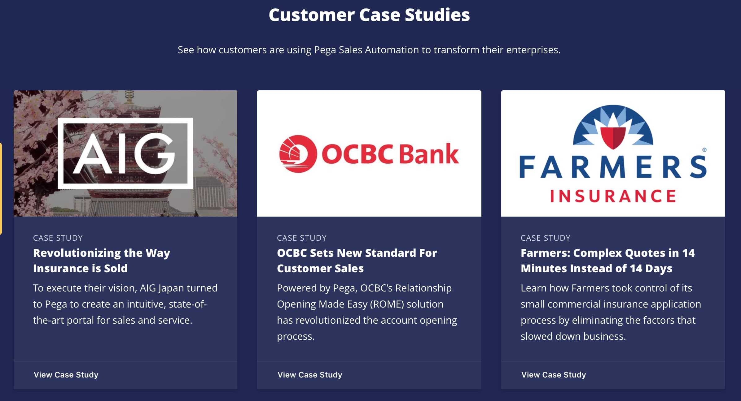
A card allows content authors to highlight a specific type of related content. It can include a video, a link to an webpage or download, or some other call to action. Cards are available in all color themes.
Best Practices
Try to use singles or multiples of 3.
Cards are best used as either a single card within a Content Body band, or as a set of 3 cards in a single band. Try not to use even numbers of cards.
Focus cards on a clear benefit to the visitor.
Use cards to call out specific, concise, links to related information within the context of a flow. Keep descriptions brief and scannable, and make it clear how this information is beneficial to the visitor.
Structure content and calls to action consistently.
Retain similar line lengths for headings and descriptions. Use either a bottom CTA link or a linked heading, but not both. To avoid cluttering the page, prefer linked headings to adding bottom CTAs, especially if the page has a number of other calls to action.
Examples
Below are some examples of how cards are used across Pega layouts.


